
TOOLS
Sketch
Figma
TEAM
Soojin Sielle Kim
Mike LePreto
Isabel Michaelides
MY ROLE
UX Designer
UX Resercher
UI Designer
TIME SCOPE
2 weeks
User Interviews
Screener Survey
Whiteboarding
Affinity Mapping
Persona
User Journey
MoSCoW Map
Design Studio
Sketching
Wireframes
Prototyping
Usability Testing
METHOD

To kick off our research, we created a screener survey in which helped us generate the initial data needed to understand our target audience and their behaviors. We received a total of 34 responses from the screener survey.
USER RESEARCH & SYNTHESIS
Required criteria:
○ Responded with a 3 or higher on “importance of mental well-being”
○ At a minimum, was aware of apps supporting mental well-being
● Selected participants that provided a range of:
○ Ages
○ Frequency of activity
○ Familiarity with apps
Finally we selected 6 people to interview for our research.
User Interviews
AFFINITY MAPPING
-
“I feel worse when I don’t/can’t do…“
-
“I think routine is important”
-
“I exercise for my mental wellbeing”
-
“I believe that mind and body are connected”
Insights:

PERSONA
PROBLEM STATEMENT
Maintaining a consistent meditation and exercise routine helps people improve mental well being. Josh’s hectic schedule prevents him from maintaining consistent routines.
How might we help Josh improve consistency of his meditation and exercise routine?
IDEATION
Before conducting Design Studio with team members, we used MoSCow Map to priotize features. Team members wrote down features in silence on post-it for 5 minutes, then we gather them on the whiteboard. It help us to focus what to sketch as well as three team members can be able to align thoughts and ideas.
Our team of 3 performed quick Design Studio 1 & 2 sessions (each session we sketched with the timer not longer 3–5 minutes) gathering ideas. We kept in mind to focus on Must features from MoSCoW Map.

MoSCoW MAP


Lo-Fi quick sketch
from team members
OUR IDEATION PROCESS
DESIGN STUDIO (Lo-Fi SKETCH) TO Hi-Fi WIREFRAME
1
2
3
4
Collaborate
final Lo-fi sketch
Create Mid-Fi Wireframe using Figma
Creat Final
Hi-Fi Wireframe
1

USABILITY TESTING | Mid-Fidelity PROTOTYPE
After we designed Mid-Fidelity prototype, we conducted a usability testing with 3 users.
Each team members participated together, conducting the test, video & audio recorded.
Tasks
3/3 users were able to complete the followings;
-
Set a weekly goal to bike 2x a week
-
Schedule a bike ride for Tuesday and Thursday
-
Log today’s 2 hour bike ride
Usability Results
The scheduling task presented them with minor issues:
-
3/3 users had trouble closing the pop-up menu
-
1/3 users tried to click on the activity icon within the day of the week


Mid to High-Fidelity PROTOTYPE SCREENS
Log page: Dafault
Goal page: Dafault

1
Increased contrast throughout all mockups
Home Menu page: Dafault
INCREASING FIDELITY | Mid to High-Fidelity PROTOTYPE
After usability test, we need to update a few things to avoid confusion for the users.
-
Home Screen buttons: Updated to give better contrast of the color
-
Schedule page:
*Made aesthetic changes to “Plan” and “See week” tabs
*Increased trigger area for closing the scheduler
*Removed shadow on icons so users do not confuse them with clickable buttons


Added section separators to clearly identify different breaks
1
1
Removed shadow on icons so users do not confuse them with clickable buttons
1
Made aesthetic changes to “Plan” and “See week” tabs
2
Increased trigger area for closing the scheduler
Schedule Page
"See Week" Page
Stats Page
Mid to High-Fidelity PROTOTYPE CHANGES
RESPONSIVE DESKTOP DESIGN

.png)
Most of the website are the same between mobile & desktop, TrackWell desktop stays same as mobile except Stats and Schedule pages.
For Desktop breakpoint, we made layout changes as below;
-
Stats page: instead of one page scrolling down for the mobile, we divided into 3 pages by daily, weekly and monthly.
-
Schedule page: We combined to one page from exercise menu button with schedule Monday through Sunday in the page.


MOBILE TO RESPONSIVE DESKTOP BREAK POINT
*Desktop break point
Mobile: scrolling down 1 page Desktop: made 3 separated pages
DESKTOP USABILITY TESTING
Executive Summary
Purpose of Test: Test users abilities to create a goal and then schedule and track activity in support of that goal.
Number of Participants: 5 participants
Areas of Focus: Focus on the ability of users to navigate through screens successfully and complete given tasks.
Opportunities for Improvement: Overall, the tests were successful, however, there were minor issues encountered, particularly around scheduling. Process can be improved by adjusting the scale of activity icons to “drag and drop” text and including a confirmation notification once all activities are scheduled.
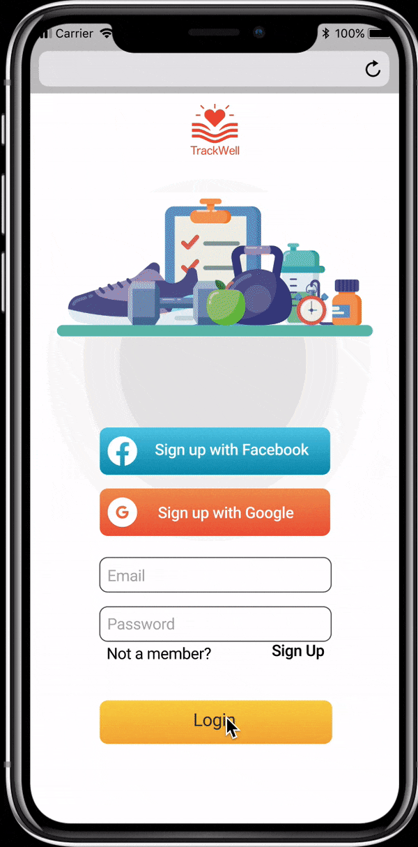
CLICKABLE PROTOTYPE MOBILE

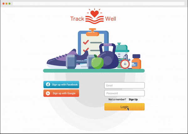
CLICKABLE PROTOTYPE DESKTOP
NEXT STEPS
-
Adjust scale of activity icons to “drag and drop” instructions on scheduling page
-
Design and test additional features including activity trackers and progress sharing
-
Social and Group/Team features to increase accountability